Web Design: 7 Top Tips & 7 Easily Made Mistakes

Nowadays, every company worth its salt has a website, and few companies would thrive without one. Your website may be the first impression someone has of your brand and company, and, as we all know, first impressions count. Good web design is a must.
In this blog post we’ll cover a bit of web design best practice, as well as a few things to avoid. We’ll go over it all in detail in a moment, but if we had to boil it down to two points:
- Do help the reader get the information they want
- Don’t give them a reason to close your site
Web Design Tips
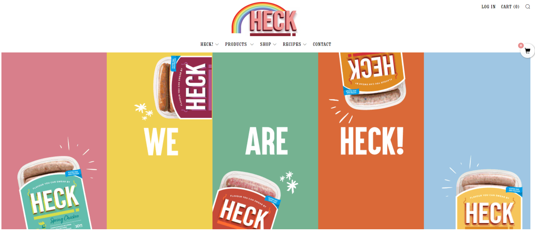
Make your homepage welcoming
Your home page is the first thing visitors to your site will see, so you should make sure it’s welcoming. Make good use of your brand’s colour palette, and avoid overwhelming the viewer by throwing too much colour or copy, or too many images at them. Utilise icons, carefully selected images, headers, and buttons to draw your viewer’s eye on a purposeful path through your website. And, whatever you do, recognise the importance of blank space in your web design.
The same goes for any landing pages you have.
Make who you are and what you do clear
Site visitors will want to know they’ve arrived somewhere that’s going to solve their problem. Perhaps they’re looking for the latest fashion, or to hire a landscape artist, or for help with a marketing campaign (*wink wink*). For this reason, you should make who you are and what you do obvious on your home and landing pages. Explain – in concise language – how you’ll help your website reader get what they want.
Ensure your branding looks good and is consistent. Check that your logos, icons, and images appear in high-resolution without artifacting, and ensure your copy paints you as a reliable, trusted, knowledgeable product or service provider.
Balance Image Quality with Size; Embed Videos
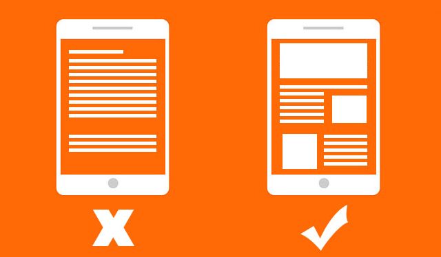
No one likes a website that loads slowly, and no one likes an image they can’t see. It’s imperative, therefore, to balance image size with image quality. It’s generally advised to keep images uploaded directly to your website under 1mb in size. If you’re struggling with this or don’t have access to Photoshop (or similar software) to resize your images, most modern website builders come with built-in image editing tools. Resizing and saving images on these built-in platforms will usually result in a good quality image that doesn’t take ages to load.
Videos should be uploaded to Vimeo or Youtube rather than directly to your site. You can then copy the embed link and embed the video into your site. This minimises load times, as the video streams directly to the viewer and downloads as it plays. Uploading the video directly to your site will (in most circumstances) result in a video that doesn’t even appear until it’s downloaded, and slows down the loading of the rest of the site, so this should be avoided.
Consider how visitors might have found your site, and what they’ll want to see as a result.
Particularly for landing pages, consider how your visitors might have arrived there. What links might they have clicked on, and what will they expect to see as a result? If you have a Facebook advert showcasing a black and blue dress, better make sure that black and blue dress features prominently on the landing page linked to the advert!
Have a clear next step.
We mentioned this briefly earlier, but you should provide clear options for navigating deeper into your site. Highlight “read more” buttons for signature products, have a menu at the top containing only the most important links, and ensure images are clickable and lead through to relevant pages. Use copy, buttons, and links to entice your visitors on a planned path through your website. This is part of your customer journey.
Use Affordances
Affordances are pieces of visual design that communicate their function to the user without the need for words.
As an example, if you’re walking up to a door and see a flat metal plate instead of a handle, you know this is a push door without being told. It’s the same principle on websites. I know that clicking a trio of horizontal lines will open a menu. I know that arrows to the sides of images will trigger the next image in a carousel. And that an up arrow in the bottom right will take me back to the top of the page. All of these are affordances.
It can be tempting to play around with design features like these in an effort to stand out, but doing so might make your website harder to navigate, and that would defeat the whole point of these features.
Use only the copy you need
We know it can be tempting to gush about your products or service, particularly if you’re head over heels for your business, but try putting yourself in the shoes of your website visitor. Consider the information they need to know to understand you and your offering.
Large blocks of text are difficult to read and can cause readers to switch off, so we recommend breaking things up into smaller chunks, and then only including the chunks that are vital. It might be that you need only a small amount of text on your home page, and can then include more product or service details on the following pages.
This is particularly important if you’re offering a bespoke service. There’s a temptation to include as many details as you can about all the possible ways in which the service can be tailored to the client, but this results in long, text-focused pages that are a chore to read. Instead, you can talk briefly about the outcomes you look to achieve for your clients, then encourage them to get in touch with you to talk about the details specific to their needs. You can also link to blog posts, FAQs, and other pages that cover things in more detail. This way, you’re providing all the information without making reading everything a requirement.
Web Design Mistakes
The time you get to make a first impression is incredibly short, so you want to avoid doing anything that makes your visitors close your site. Here’s a quick list of things to avoid:
Don’t include every page on your menu
It sounds logical to put every page of your website onto your website menu, doesn’t it? But doing so can actually make your website harder to navigate. Menus with long lists of options or multiple dropdown lists can leave the reader blinded by choice, and give little indication of where to go next. Vague or lengthy page names only compound the issue.
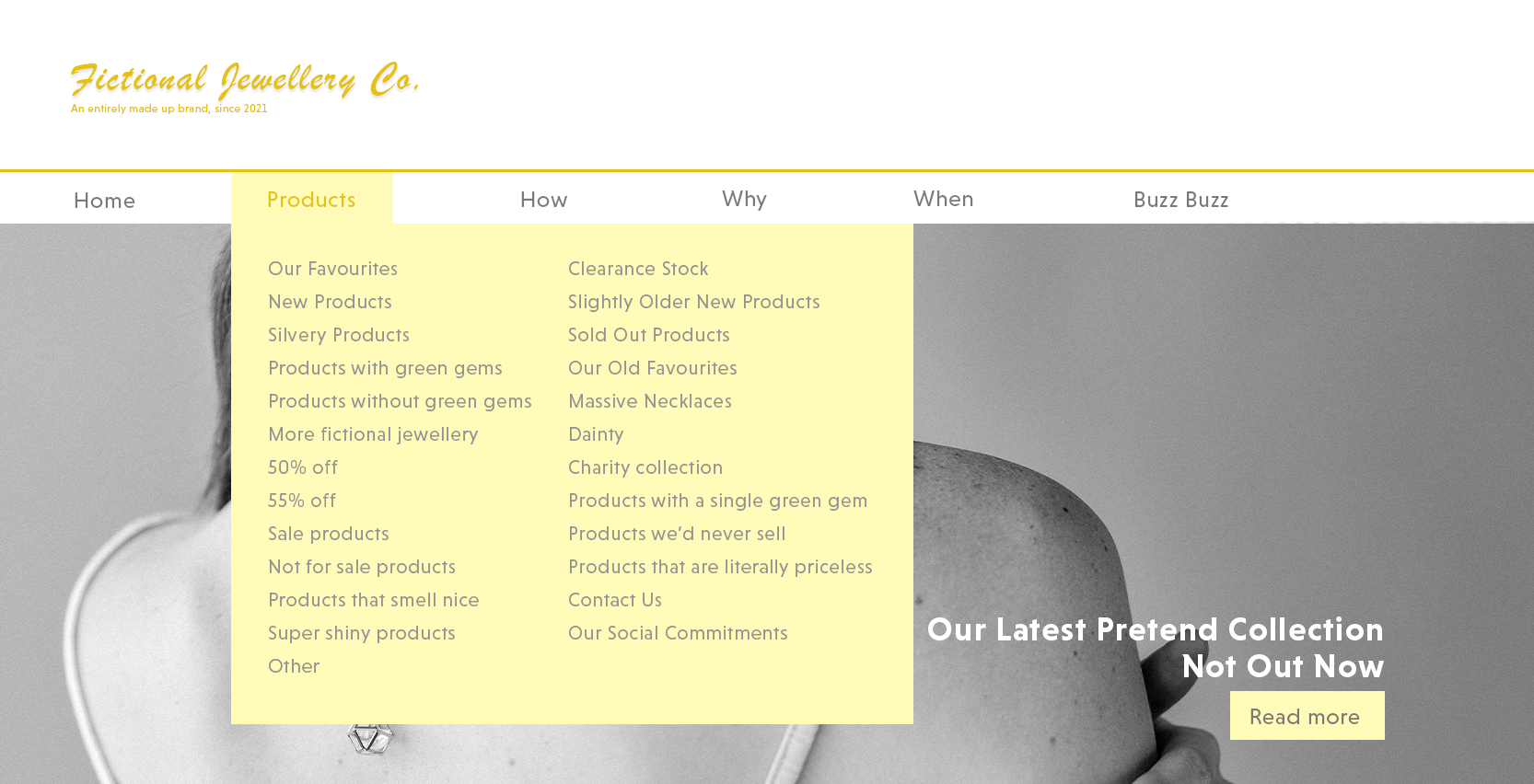
Instead, choose to include only the most important pages in your main menu, then provide more options on subsequent pages. If you must include many pages in your menu, be sure to give them a clear, logical hierarchy, and focus on making that menu as easy to navigate as possible using different font formats and colours (but use these sparingly!). We’ve seen at least one site in the last week using a combination of vague page names and massive menus. The worst part? It was a web design agency site.
The same goes for including lots of buttons. A button on your home page for every product you sell is overkill, especially if there’s nothing to indicate which buttons are more important than others.
Too many click throughs
That said, avoid making the user click through too many pages to accomplish simple things. If I want more information on a product, don’t make me load a new page to view the product range, then a new page to view the chosen product, then another to view the product specifications, and another about options, reviews, etc. (Didn’t that sentence get tedious? Imagine how your website viewer might feel!)
In this instance, every click through means more load time and takes me one step closer to closing the site and giving up. It might not feel like it to you, but to the reader, it feels like you’re deliberately obscuring information, and that you don’t value their time.
Put as much information as is appropriate on one page, and again, focus on making it easy to navigate.
The Endless Scroll
There’s a trend in web design currently for one-page sites. As the name suggests, most of the site is put on one long page. This can be very useful for service-led sites, as it reduces time spent loading different pages and figuring out where to go next. Navigation is further aided by anchor links: buttons that when pressed move up or down the same page rather than loading a new one. This negates the need for users to manually scroll further and further down your page, which is great, because manual scrolling gets tedious and makes information easy to miss. But there’s a dark side to the one-page site.
This one-page trend has led to some web developers focusing on providing a “unique web experience”, almost akin to a mini art exhibit or slideshow. We’ve seen one website recently where arriving readers are presented with a single sentence on a coloured background. Scrolling down changes both the sentence and the colour, and eventually you reach information about the company and its services. The company clearly thinks they’re providing a cinematic website experience, when in reality, they’re putting more time between the reader arriving and the reader getting the information they want.
Avoid Off-Putting Imagery
This might sound obvious, but you’d be surprised how frequently it happens. Horrible-looking food and bizarre close ups of cow noses are examples we’ve seen recently, and they serve only to make your reader startle, frown at the screen, pull away, or close your website entirely.
Unnecessary Animations
Subtle animations are great for making a website feel high-quality, but they can also negatively impact load times. Use animations sparingly, because a slow site is inherently hard to navigate.
Additionally, try to avoid animations or gifs that loop constantly or quickly, as these can be distracting, taking attention away from the important point you’re trying to get across.
Avoid Pushy Chatbots
Chatbots are a great addition to many websites, but not every user likes them. A chat bot that’s overly pushy (e.g. one that sends a message every thirty seconds, or a welcome message that includes an immediate sales call to action) can be instantly off-putting, making your user feel you only care about making a sale.
Likewise, make sure your chatbot is legitimately useful for your visitors. Avoid installing a chatbot if it’s just going to direct people to an FAQ page instead of actually helping solve a problem.
Pop-ups
Nobody likes pop ups. Even web designers who love installing pop-ups hate being presented with them while browsing. They almost always interrupt something the reader is doing, and are usually unwelcome (even if they’re offering discounts). Avoid them.
Even worse are “before you leave” pop-ups. It’s becoming increasingly common to code pop-ups to appear when people move their mouse towards the top of the screen to navigate away from your website. Usually these pop-ups contain an offer or something else designed to entice a person to stay on the site. This might sound logical, but we’re against them, and here’s why: by the time one of these pop-ups appears, the user has already made the decision to leave, and all you’re doing is inconveniencing them. You risk turning a disinterested visitor into one that actively dislikes your company.
Need web design help?
That’s our list. Seven web design DOs and seven DON’Ts. Is there anything we’ve missed? Perhaps there’s something we’ve said you disagree with? Feel free to get in touch with us by email, or over on Facebook or LinkedIn.
Related Posts
-
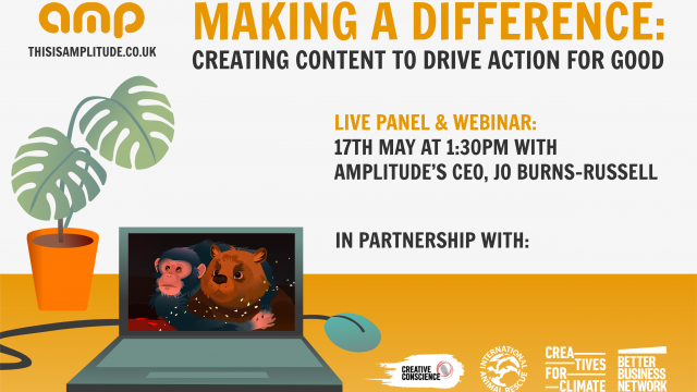
Making A Difference: Creating Content to Drive Action for Good
April 27, 2023 -
The Rise of Short Form Social Media
October 24, 2022 -

Central Changemakers and the Four Day Work Week
September 30, 2022